

A website is a virtual platform representing any business. Just like an outlet providing certain services earns customer satisfaction, consistent profit, and growth by being customer friendly, a website ought to do just the same. It must offer a great user experience (UX) that eventually converts to monetary profit and bring more customers in future. To improve user experience with time with an excellent website and earn satisfied customers, first, you need to get well-versed with what user experience really implies and how effective it is.
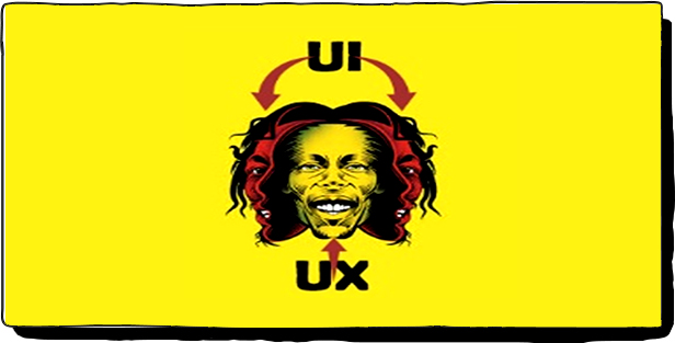
While learning about working on your UX, understanding UI is unmissable. A user interface (UI) and user experience (UX) sound similar, work similar but still, there is a clear difference between both. In the simplest terms, UI is a set of screens, pages, navigations, buttons and icons to help customer reach his requirements from the website. On the other hand, the experience he draws browsing the website with the help of these tools is what counts for a UX of that website. UI is more visible while UX is more to be experienced.
Humor Is Needed Everywhere: We see our colleagues bonding over cheeky jokes every day. Memes go viral in seconds and before you know everyone around you is talking about the same meme. People share their personal accounts of funny incidents on social media platforms all the time including your own nagging boss. You cannot find anything completely deprived of humor or sarcasm no matter how focused or serious it is supposed to be. In the same way, you can mix the humor and play with the visitor’s mind a little and make your website a whole different experience for them.
UX extends from the feeling of a website to encompass all the facets of a user’s interaction with the business and its services and products. A customer when visits a website all he expects is how easily and smoothly he gets to the content he is looking for. And to design a UX that feels interesting and engaging, humor and it can be utilized to create a world of wonders. You need not stress yourself on using humor as a single reserved section, in fact, you can mix humor in all the aspects to make your website more interactive and deliver an amazing UX.
Right from the designing process, UX is induced by various factors like the appearance, interactive experience and navigation. The user is never interested in how you do it, he only concerns with how well it comes out for him in the form of outlook and features. More importantly than addressing all these factors individually, you gotta take them all hand in hand for a successful UX.
Also Read: Get on with video marketing for better SEO results
Your website might look very beautiful and have the best interface too but if the content of the website is unnecessarily incomprehensible to the customer, it will end up marrying the overall user experience. So let’s make the content more fun, interesting and engaging by introducing humor in it with style. You have to work on a great integration of outlook, interface, and content while making the best use of humor. Let’s discuss the tactics in discreet points about how you can manifold the UX by using just the right amount of humor in various aspects from the logo to the welcome page.
A Relatable Logo:
You can treat your visitors with an active sense of humor to a logo that can look extremely simple for some but has a lot of funny angles for those who have an eye for details. So get your logo designed with someone who knows how to play with the structures and images.
Interactive Text:
From the welcome page to the internal information pages, you can choose either a text that is simple and interactive or you can weave a web of words that make little sense and confuses more. Give your text an angle of interaction by adding questions or mentioning something that brings a pause and an urge to think upon. You can also add real-life quotes or one-liners having a direct humor. These are the little somethings that remain in mind even after the reader leaves webpage.
Practical Descriptions:
You gotta sound to the point while explaining your products and services. And you can do it without sounding boring, but how? The answer is humor. Choose practical descriptions using a funny but logical tone that makes more sense instead of aiming arrows in the air. For example, if you are a web solutions company, you can put it up, “We are the ninjas of designing awesome apps that keep the visitors lurking” rather than saying, “We take pride in designing bespoke web applications”.
Believable Images:
While trying to impress customers, also keep the credibility in mind. A customer will doubtlessly prefer a more realistic picture of a pompous long story. Your images, headlines, and text should read and sound realistic rather than screaming ‘Fake’. And how else will you make it sound more lifelike than adding a pinch of humor and sarcasm? But instead of forcibly stuffing blunt jokes here and there, This is where you can develop an unspoken bond and connect with your visitors by making them feel a connection.
You can also use an engaging mix of images and texts that are more readable and noticeable than plain text. You can also break down the images with funny captions. Going colloquial with humorous quotes can make your web content much more interesting than that of your competitors.
Comparison Using Humor:
You don’t need to go offensive while comparing your resources with those of your immediate competitors. There is always a funny way of doing it. Use humorous analogies and puns to pose your services smarter than that of your rivals. It not only makes your visitors crack up in a giggle, it also doesn’t let you look cruel or self-conceited.
Maintain Brevity But Inject Fun: Let’s face it, your content might be super entertaining but no visitor comes with an intention of spending hours turning your web pages. So it’s important to respect the difference between boring lengthy paragraphs and crisp sentences that convey the intended message and make you smile and laugh simultaneously.
Engaging CTA:
Call to action is the most engaging thing a visitor is going to land on a web page. You can place it tactfully and get your customer’s valuable time and feedback without even making him realize the time expense. However, every call to action need not be a survey or a questionnaire. You can cleverly engage your visitor’s time in a small fun act, intelligent joke or trending meme.
Apart from the content, the placement of CTA is also of an equal concern. It should not be buried under the layers of pages but should surface right in front when someone opens the page.
Improve Readability:
Unreadable text can simply repulse a visitor’s interest even before he makes up his mind. One might not give it of much importance but minute things like the font type and size play vital roles in determining the overall readability. It also motivates the reader’s interest. Break the sentences in small. Use bullet points where necessary so the text doesn’t look crammed.
However, this is a place where you might want to pull your hands back in having a humorous take. Because funky fonts may seem interesting but they make it lose its volume altogether. But still there remains some scope of soft jokes even in dealing with the readability of the text. Introduce small breaks by slowing down your reader for good with a small dose of fun. Add some unexpected pages that are funny yet relevant.
Quirky Newsletters & Messages:
Who says that your message layouts necessarily need to be the same dull and boring templates as everyone else? Personally, I open the mails only that appeal me with humor and same is with the websites. My personal favorites are the ones that crack me up often and make me stay with their puns. So get the hint and get your writers to twist the content of the mails and newsletters in a funny way.
Keep Changing:
While applying humor to your text, keep changing the punchlines, funny quotes and the humorous images from time to time keeping the ones constant that count for branding such as the opening image.
There are so many funky ways to inject humor into your website without making it a forced comedy fest. While using humor as a tool to enrich user experience, you also have to be careful in making jokes and pasting memes.
Keep it light and healthy instead of heavy and boring. Use personifications and give your error pages a funny twist than making them regular boring ones. Distort the icons and make the visitor wonder. There is so much you can do with humor without deviating from what you aim to convey to your customers. So, use humor, pun, sarcasm and silliness to up the user experience several notches higher and increase your sales and benefit your business overall with the simple tricks. And create your own space in the huge market space.